Marked a milestone for a PV Drilling & Well Services Corporation by creating an anniversary book. Was brought on board to design a visually striking commemorative book for the corporation. The final design consists of pages graced with lively photos that reflect PV Drilling’s values while demonstrating its varied work.
A range of credit cards were redesigned to create a more refreshed brand image for VIB, Vietnam International Bank. Vietnamese elements were used to give traditional values a modern touch. The new look of VIB credit cards shows the spirit of the bank. Steering clear of corporate imagery, a hint of Vietnamese culture relfected to the card range by adorning each one with pride-provoking symbols.
Collaborated with Chi Hoa resturant to create a whole new look for vietnamese home cuisine. Using traditional colors and homely images, showed the friendliness, coziness and taste that can be experienced at Chi Hoa restaurant. The identity, website and promotional materials center around floral motifs, earthy tones and rough textures. This handcrafted aesthetic gives a feel for Chi Hoa’s traditional character.
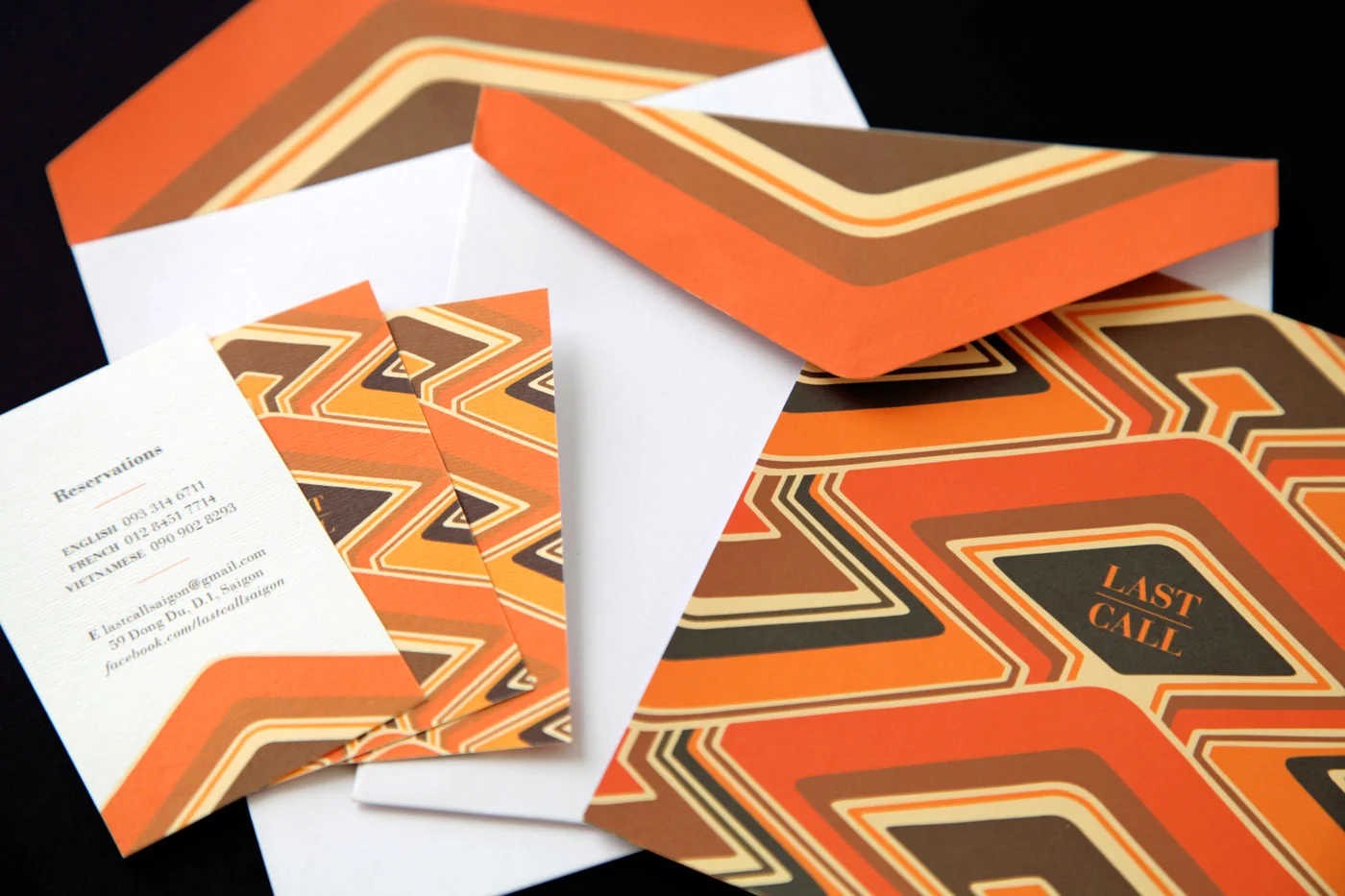
Last Call cocktail bar wanted a chic interior and identity that matched the relaxed retro vibes of the bar. The logo, brand pattern, signage, menus, and communication materials were all inspired by pattern designs of the 70’s.
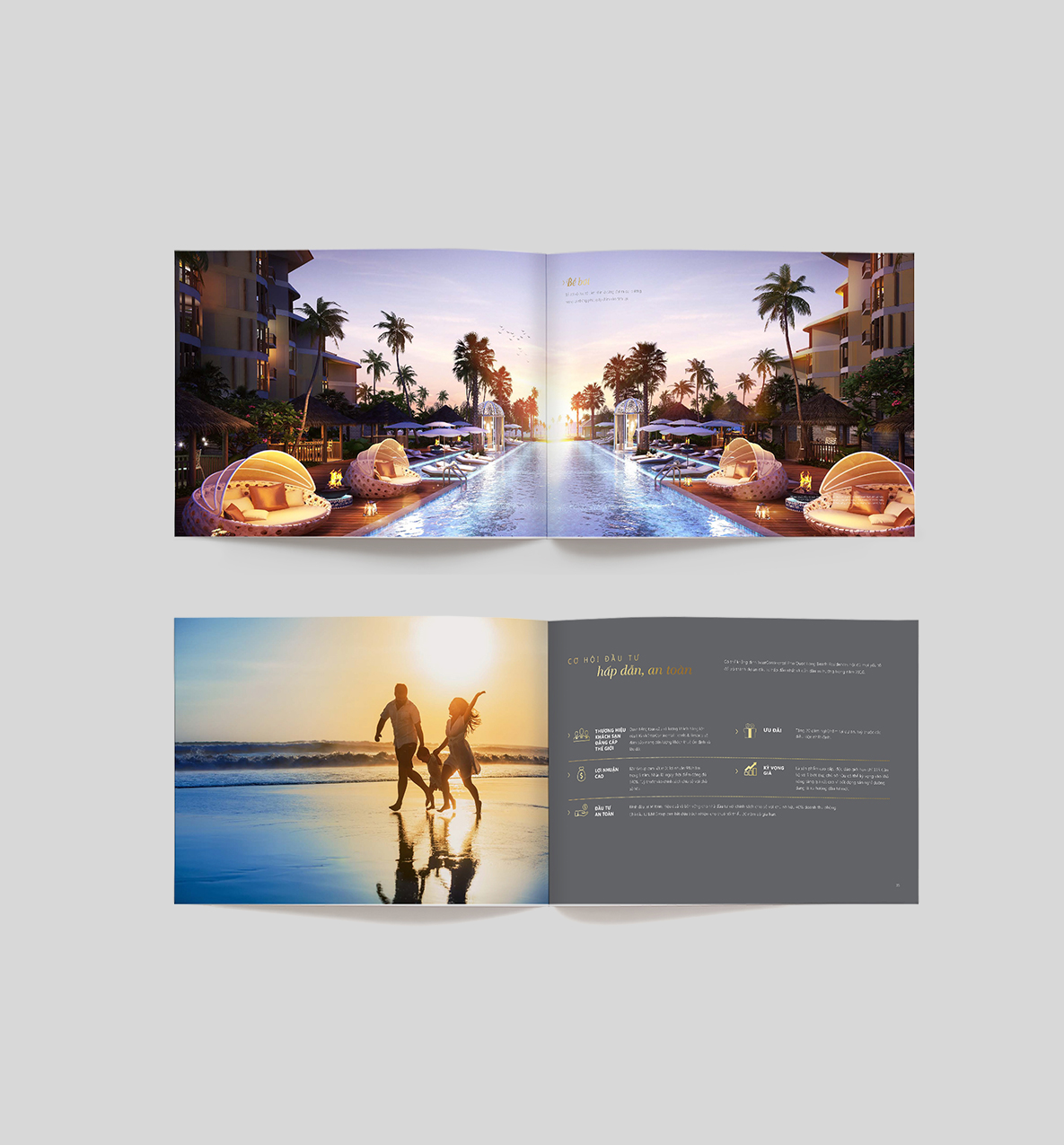
As a trusted premium brand, Intercontinental Hotel Company brings guaranteed quality to residents of their Phu Quoc apartments. For the launch campaign, a website and set of collaterals were created that demonstrate residents’ inner peace. The sale kit represented the finest features of the development and made potential buyers long to be there.
Designed the first concept store for Biti’s Hunter footwear brand to introduce a new shopping experience for young customers. It’s not just the store’s design with minimalist style and the choice of dark colors: black and grey to indicate the strong brand personality but also a shopping experiences reflecting the active spirit (moving) of brand that was brought into the store.
Mirum est notare quam littera gothica, quam nunc putamus parum claram, anteposuerit litterarum formas humanitatis per seacula quarta decima et quinta decima. Eodem modo typi, qui nunc nobis videntur parum clari, fiant sollemnes in futurum.
Designed promotional materials brimming with personality for the British Eduction Partership Organisation. The brand colors were used alongside energetic, hand-drawn visuals to produce an updated website and remodeled promotional materials.
This print campaign for Essance Comestics Brand encouraged the youth of vietnam to love themselves and be proud. While many brands set specific standards for women’s looks (white skin, big eyes, etc.), Essance embraces all kinds of beauty and the uniqueness of each individual. With the message “I love my face”, Essance inspires Vietnamese girls and enhances their self-confidence.
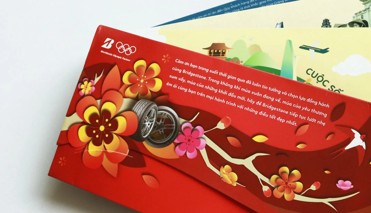
Bridgestone Coporation collobrated with Vietnam Airlines to produce boarding pass cases. Travellers were given a helping hand as they set out on their journeys by designing these seasons-themed document cases with an informative guide to find their way around. Scenes of the four seasons delights in Vietnam and our lively colour palettes gave flyers a lift.
Satori - a water company that cares for people. Satori understands our mental and physical health is fundamentally linked. That’s why their mission statement is to make consumers healthier by providing safe, reliable water and deliver the healthiest and tastiest drinks to inspire people to live healthier lives.
The design reflects a hip youthful look with delicate healthy tones.
A poster was designed for Olay’s total effect product. It won Bronze award at the Cannes Advertising Festival in France and Asia Pacific Advertising Festival in South East Asia.