Collaborated with photographer Fred Wissink to design his photography book, Expat. Expat is a series of portraits and anecdotes that explore the lifestyle of modern day nomads, who left their native country to create a new home abroad.
A range of credit cards were redesigned to create a more refreshed brand image for VIB, Vietnam International Bank. Vietnamese elements were used to give traditional values a modern touch. The new look of VIB credit cards shows the spirit of the bank. Steering clear of corporate imagery, a hint of Vietnamese culture reflected to the card range by adorning each one with pride-provoking symbols.
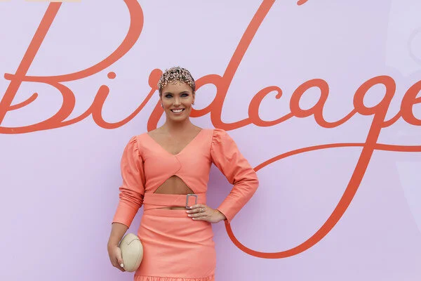
This design was developed into the theme for the iconic Birdcage at The Melbourne Cup premium marquee enclosure at Flemington Racecourse in 2019. The concept design reflected the overall theme of the enclosure, The Art of Happiness. The motion of the bird moving through the brand reflected the feeling of happiness and contentment as patrons moved throughout the Birdcage. The logo was developed in a series of color editions and spread across the enclosure area.
A bold modern design to create a fresh striking atmosphere to The Parade Lounge Bar at the Flemington Racecourse Melbourne Cup in 2019. The black and white patterns complimented with gold lettering and lush greenery to elevate the contrasting tones. Different pattern designs apply in different areas to create a unique experience in each area, yet also melded in to conform with the overall design and experience to the bar’s concept theme in 2019.
Designed the first concept store for Biti’s Hunter footwear brand to introduce a new shopping experience for young customers. It’s not just the store’s design with minimalist style and the choice of dark colors: black and grey to indicate the strong brand personality but also a shopping experience reflecting the active spirit (moving) of brand that was brought into the store.
Collaborated with Chi Hoa Restaurant to create a whole new look. Using traditional colors and homely images, showed the friendliness, coziness and taste that can be experienced at Chi Hoa Restaurant. The identity, website and promotional materials center around floral motifs, earthy tones and rough textures. This handcrafted aesthetic gives a feel for Chi Hoa’s traditional character.
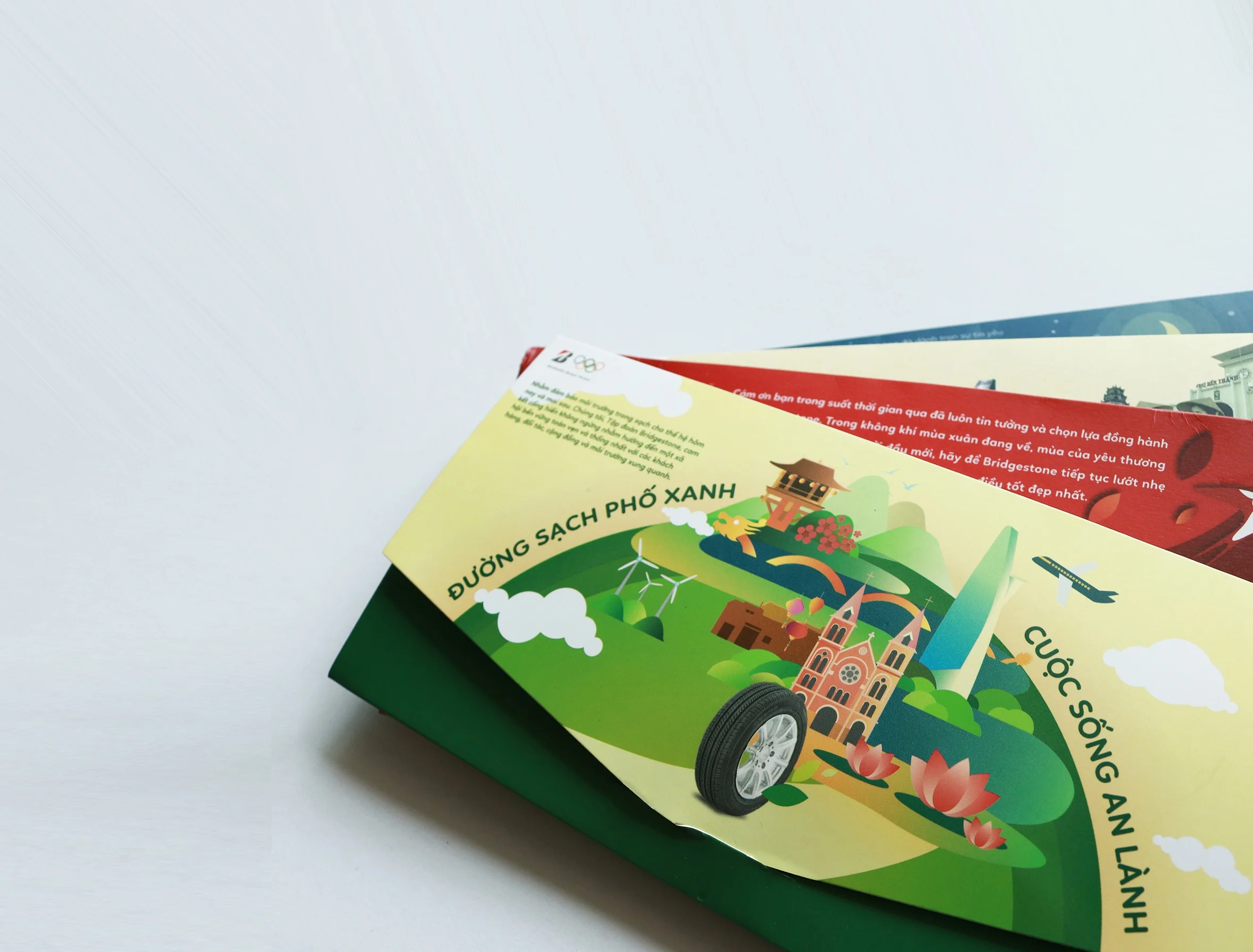
Bridgestone Corporation collaborated with Vietnam Airlines to produce boarding pass cases. Travelers were given a helping hand as they set out on their journeys with seasonal themed document cases with an informative guide to find their way around. Scenes of the beauty of the four seasons in Vietnam and our lively color palettes gave flyers a lift.
Last Call Cocktail Bar wanted a chic interior and identity that matched the relaxed retro vibes of the bar. The logo, brand pattern, signage, menus, and communication materials were all inspired by pattern designs of the 70’s.
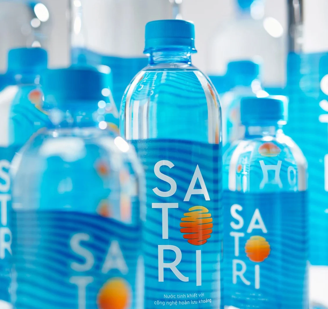
Satori - a water company that cares for people. Satori understands our mental and physical health is fundamentally linked. That’s why their mission statement is to make consumers healthier by providing safe, reliable water and deliver the healthiest and tastiest drinks to inspire people to live healthier lives. The design reflects a hip youthful look with delicate healthy tones.
Marked a milestone for a PV Drilling & Well Services Corporation by creating an anniversary book. Was brought on board to design a visually striking commemorative book for the corporation. The final design consists of pages graced with lively photos that reflect PV Drilling’s values while demonstrating its varied work.
This print campaign for Essance Cosmetics encouraged the youth of Vietnam to love themselves and be proud. While many brands set specific standards for women’s looks (white skin and big eyes). Essance embraces all kinds of beauty and the uniqueness of each individual. With the message “I love my face”, Essance inspires Vietnamese girls and enhances their self-confidence.
Jinn is a boutique real estate company in Vietnam. The brief for this project was to overhaul their website, app and property portal to make them more inviting and user friendly.
As a trusted premium brand, InterContinental Hotels Group brings guaranteed quality to residents of their Phu Quoc apartments. For the launch campaign, a website and set of collaterals were created that demonstrate residents’ inner peace. The sale kit represented the finest features of the development and made potential buyers long to be there.
Myanmar Plaza is Yangon’s first international shopping center. On the playground of social media, helped Myanmar Plaza take pride in being the most awesome place for Myanmar to shop and have fun. To celebrate big events at Myanmar Plaza, themed spaces were developed with a festive atmosphere. The décor for events such as Christmas and Valentine’s Day have given customers a place to celebrate with the whole family.
Brought a sense of adventure to TMG, Hospitality Company with a design of destination-based brochures. For the brand that prides itself on its all-inclusive services, we showed off the vast array of experiences on offer and the ease of traveling with TMG.
Teamed up with Toyota to design and organize an event that educated children about road safety. A playful cityscape environment was used to teach the rules of the road in a fun, exciting way. Kid-sized vehicles and friendly characters encouraged the whole family to get involved.
Designed promotional materials brimming with personality for the British Eduction Partnership Organisation. The brand colors were used alongside energetic, hand-drawn visuals to produce an updated website and remodeled promotional materials.
For this project hey required an overhaul of their brand packaging to give it a more modern, fun and refreshing look.
Launch a fashion brand that dedicated most of it’s profits to clothing the underprivileged. With the mission of giving a new brand a new appearance, not just an electronic interface, designed a friendly website where customers can feel the story behind Ugether. To create a consistent look that stays true to Ugether’s values, designed a responsive website and a vibrant identity with simple, minimalist graphics.
Zin Zin, the first milk with natural fruit juice extract in Vietnam to meet the nutritional needs of children with a balanced nutrition formula. For this project they required an overhaul of their brand packaging to give it a more modern, fun and refreshing look.
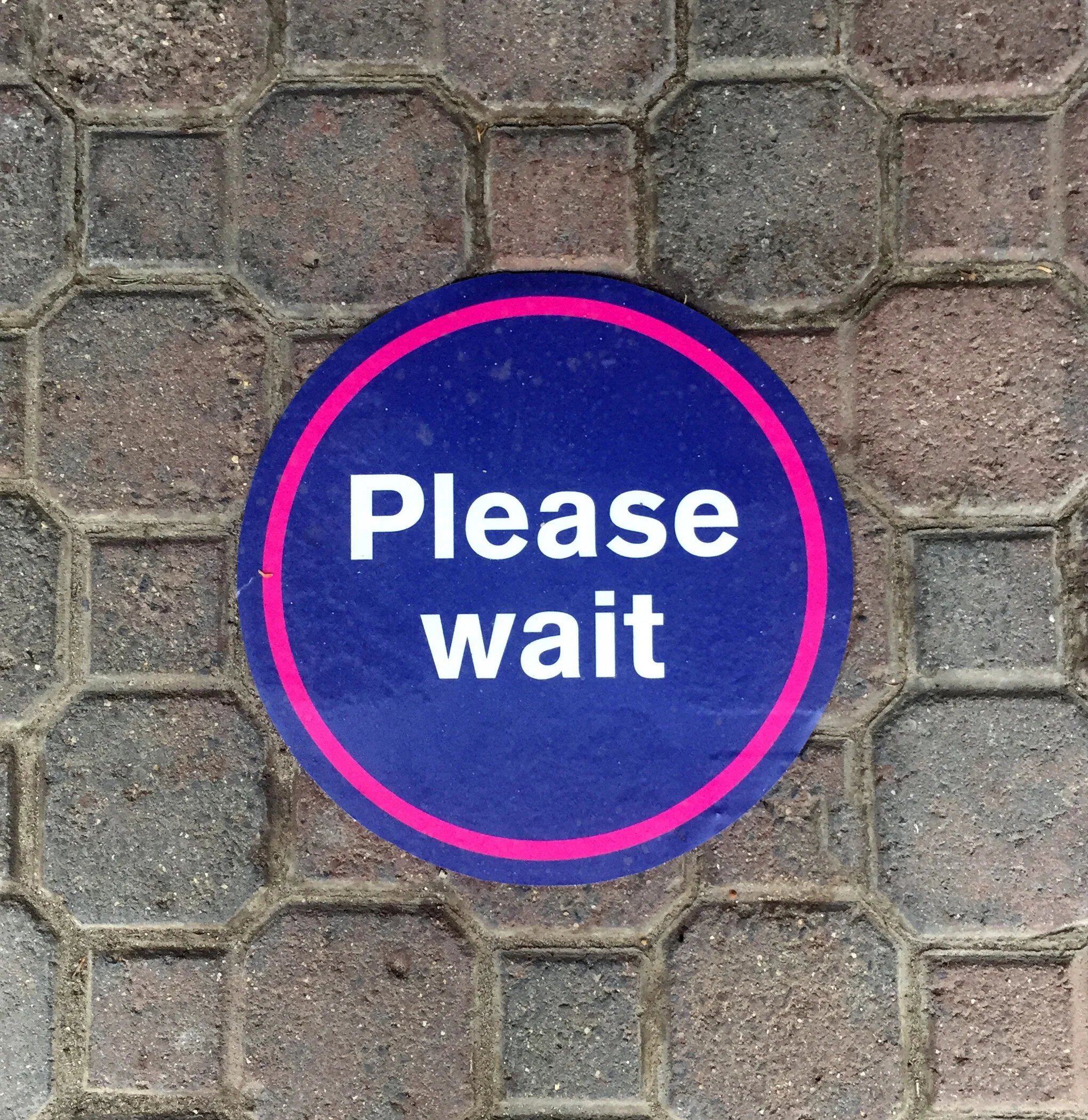
To ensure a safe working space and customer experience on course for the Victoria Racing Club, a collection of COVID signage was developed communicating a warm friendly tone to encourage and create a safe environment. Vibrant colors were created for strong visibility paired with recognizable pictograms to convey the messaging clearly. Speech bubbles were depicted to create a personal human feel.